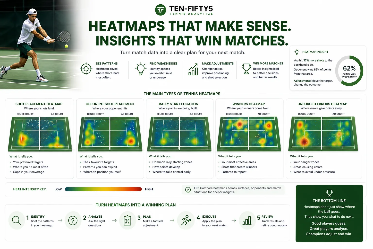
Most tennis apps will hand you a heatmap and leave you to it. You see a court, a scatter of coloured dots, maybe a warm blob near the baseline — and no idea what to actually do with it. So the picture gets a nod, a "huh, interesting", and then it's forgotten, while the pattern it was trying to show you keeps costing you matches.
That's a shame, because a heatmap is one of the fastest ways to see your own game the way a scout would. It turns a two-hour match into a single picture you can read in seconds.
This guide walks through the main types of tennis heatmap, what each one is really telling you, and the specific questions to ask so the colours turn into a plan for your next match.
What a tennis heatmap actually shows
A heatmap plots where something happened on the court and uses colour or dot density to show how often it happened. More activity in a spot means a hotter, brighter or denser area; rarely used areas stay cool or empty.
The important part — and the part cheap heatmaps get wrong — is that a good map layers outcome on top of frequency. It's not enough to know you served wide 40% of the time. You need to know your win rate when you went there. A zone can be busy and still be quietly losing you points. Frequency tells you your habits; outcome tells you whether those habits are any good.
So whenever you open a heatmap, read it in two passes:
- Pass one — frequency: where do I go most often? Am I predictable?
- Pass two — outcome: where do I actually win, and where am I leaking points?
The gap between those two answers is where your easiest improvements live.
The serve heatmap
The serve map is where most players start, because the serve is the one shot you completely control. A proper serve placement heatmap splits the box into three zones — T (down the middle), body, and wide — and shows both how often you hit each and your win rate from each.
Read it like this:
- Check your spread. If 60%+ of your first serves cluster in one zone, you're readable. Good returners will camp there. A balanced map keeps them guessing.
- Find the winning zone you underuse. It's common to see something like a 78% win rate on wide serves that you only hit 20% of the time. That's free points sitting on the table.
- Split deuce and ad courts. Your wide serve on the deuce side and your wide serve on the ad side are different shots with different results. Read them separately.
- Filter to break points. Compare your serve map under pressure to the rest of the match. Many players collapse onto one "safe" zone at 30-40 — and that's exactly when they get attacked.
- Read first and second serves separately. Most players have a decent first-serve map and a cramped second-serve map bunched in the middle. If your second serve only lives in one small zone, that's a pattern opponents will attack all day.
One reading of a serve map usually produces a single, concrete instruction: serve more balls into the body on the ad side. That's the whole point.
The return heatmaps
Returns give you two maps worth reading together: where you stood to return, and where your return landed.
Your return-position map shows how deep or shallow you set up. If you're returning a big first serve from two metres behind the baseline every time, you're giving away court and time — the map makes that habit impossible to ignore. Against second serves, the same map should show you stepping in; if it doesn't, you're passing up easy aggression.
Your return-target map shows what you did with the ball. Are your returns landing deep and central (safe, resets the point) or drifting short (invites the server to step in and dictate)? A cluster of short returns is one of the most common hidden leaks in club tennis, and it rarely shows up in a scoreline — only on a map.
Read both against your return win rate. A deep-return map with a poor win rate usually means the depth is fine and your next shot is the problem, which points you at the rally maps below.
Groundstroke and rally-position heatmaps
Once the point is live, two more maps tell the tactical story.
A groundstroke map plots where your forehands and backhands are landing. Read it for depth and direction: balls dying in the mid-court — the dreaded no-man's-land between service line and baseline — are the ones that get punished. A healthy map is weighted deep and uses the corners. A map that glows in the middle third of the court is telling you your rally ball is sitting up.
A rally-position map, sometimes called a court-coverage map, shows where you stood during rallies. This is the one that exposes patterns you can't feel in the moment:
- Are you stuck behind the baseline all match, never stepping in to take time away?
- Are you drifting around your backhand corner, exposing the whole forehand side?
- Does your coverage collapse in longer rallies, so you're always on the retreat?
A map skewed to the backhand corner is worth pairing with your unforced-error map. If errors spike in the same corner, you've found a technical or tactical leak in one image.
Pair the rally-position map with a rally-length breakdown and you get the full picture — not just where you stood, but whether your positioning holds up as points get longer. Most players find their win rate falls off a cliff after seven or eight shots. The maps show you why.
Reading maps across matches, not just one
A single match's heatmap is a snapshot, and snapshots lie a little. The real value shows up when you compare the same map across several matches.
Is your serve-wide win rate climbing as you commit to it? Is your rally position creeping forward as you get more aggressive? Is that backhand-corner error cluster shrinking after two weeks of drilling it? A one-off map tells you what happened on the day; a trend tells you whether you're actually improving. Three to five matches is usually where a pattern separates itself from a bad afternoon.
Turning colours into a game plan
Reading heatmaps well comes down to a repeatable habit. After every match, ask the same five questions:
1. Where am I predictable? (Any zone I use more than ~50% of the time.) 2. Where do I win but rarely go? (High win rate, low frequency — do more of it.) 3. Where do I go but rarely win? (High frequency, low win rate — cut it or fix it.) 4. What changes under pressure? (Compare break points and second sets to the rest.) 5. What's my one instruction for next match? (Force yourself to name a single change.)
That last question matters most. A heatmap that produces five vague observations changes nothing. A heatmap that produces one clear instruction — stand a metre closer on second-serve returns — changes your next match. Read for the instruction, not the trivia.
Where players go wrong
A few recurring mistakes are worth avoiding:
- Reading frequency as quality. Say it until it sticks: hot means often, not good. Always pair placement with win rate.
- Chasing tiny samples. Two double faults into the body zone isn't a pattern. Look for zones with enough shots behind them before you rebuild your game around them.
- Fixing everything at once. A busy heatmap is tempting to over-interpret. Change one variable, re-measure next match, then move to the next.
- Ignoring context. A defensive position map against a huge hitter is sometimes the correct choice. Read maps against the opponent and the score, not in a vacuum.
Why depth beats a single dot map
Plenty of apps show one shot heatmap and call it analysis. The value is in reading the full set together — serve, return position, return target, groundstroke and rally position — because tactics live in the connections between them. A short return (return-target map) that leads to a defensive rally position (coverage map) that ends in a mid-court forehand getting punished (groundstroke map) is one story told across three pictures. See only one and you miss the cause.
Ten-Fifty5 builds all of these from a single match video, plotted on court heatmaps with win-rate breakdowns by zone — the same chart vocabulary you see on ATP broadcasts, applied to your own footage. If you want to see how the pipeline turns a phone recording into these maps, the how-it-works overview walks through it, and every plan includes the full heatmap suite plus an AI coach that reads the maps with you. Coaches can read them across a whole roster of players to spot the junior whose rally coverage is quietly slipping before it shows up in results.
The scoreline tells you that you lost. A heatmap tells you where — and, if you read it in two passes, exactly what to fix first.
See your own game in data
Your first match is free — no credit card. Full dashboard, heatmaps, and AI coaching in a couple of hours.
Analyse my first match free